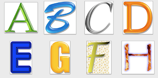
I've been busy with writing a software review for ATPM.org, the online magazine mostly devoted to the Macintosh personal computer. The software is called Art Text. Think of it as somewhat of a Photoshop for text. You can do many things to plain-looking text to spice them up. In the accompanying image, I used Art Text to adjust various parameters of text objects. Each letter is a different picture exported from Art Text. A through D are actually pretty plain, only the typeface and shading were changed. A's shading is green glass, C is metallic, D is orange plastic, and I can't remember what B's material is. For E, I employed the Stroke effect to give the letter an outline. G reverts back to simple shading, but it's such a good one - it's called Egg. Sure looks egg-like, no? With F, I used a yellow gradient and since flower starts with F, I threw in a daisy field in the background. Lastly, for H as in HOT, I used a fire texture. It helps that the font I used for H, papyrus, is somewhat squiggly, like the tongue of a flame.
I've proofread many articles for ATPM and for my first review, I consulted their guidelines. I worried too much about adhering to the guideline, such as what info to include in the review heading and how to rate the software, and as a result had quite a stumbling block to get up and running. I think I finally got something going now, but just to get started was painful. Sometimes it's just easier to jump in and fix things up later.
No comments:
Post a Comment