My accompanying text is
@NewtonRunning #RunningMakesMeFeel HOT, b/c I sweat easily, but, ladies, feel free to think "hot-looking" #promo
Nowhere does the contest rule says there will be points for humor but I couldn't help it. The rule does say
1) creativity and composition of word(s) and caption (33%), 2) originality of word(s) (33%), and 3) ability of word(s) and caption to portray how running makes you feel (34%) (the “Judging Criteria”).
Criteria #1 is easy to understand, #2 is kinda tricky, as there are only so many adjectives you can describe the feeling associated with running. Truly feeling it, and the word should not be crazy long that one would have to run marathon distance to make it. Criteria #3 is even harder to interpret, I guess it's all in the way you write your caption, with Twitter's 140-character limit and all. Instagram can be used also but I hate its square limitation. My GPS arts are usually rectangular-shaped, i.e. two distinct dimensions and not all four sizes are equal, so to satisfy Instagram I would have to do some extra work.
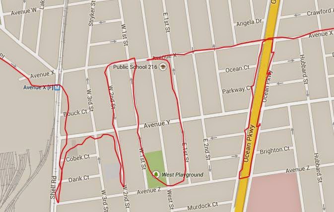
One day, instead of worrying about these restrictions of the Spell Challenge, I went out for a run with something else in mind to spell. Johnson & Johnson is a great sponsor of Charity Miles, which I in turn am a great supporter. While I can technically run whatever distance needed to spell out Johnson & Johnson, I decided to take advantage of the repeated name and only ran Johnson.

I took care to include the plus sign under Johnson. I know, it is not much of a plus sign but my restrain with GPS art is everything has to be connected. At the moment I did not consider running up and down East 3rd Street instead of making the loop.

Johnson & Johnson, after a few minutes in Photoshop. Since Ocean Parkway is already highlighted on the map, I artificially lined it up when I stitched the original picture and its clone. I carefully cropped out the plus sign in the lower picture. Could be better, but good enough for illustration purpose.
good post
ReplyDelete